Recently
we went downtown Chicago to see the play "Jitney". This sparked
debates in class about the differences of our lifestyles in the north shore
compared to that of the north side, or south side of Chicago. Instead of
sharing my personal experiences, I decided to explore different maps depicting
various statistics of Chicago. I want to see what affect these maps have on us,
and our perception of Chicago.

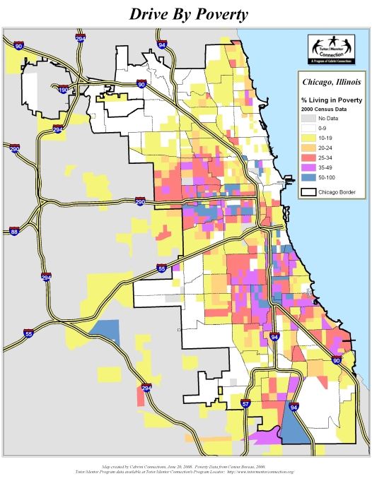

My
first impression of these maps was that, even though representing very
different things, they looked fairly similar. Each map has a clear division
between the north and south side of Chicago, while the west side is scattered
with variety in each map. Although, there are some areas that these maps
greatly differ. For example, most of the areas with extreme violence seem to be
in poverty, except there is a large region in the south east side of Chicago
that is extremely poor, but only moderately violent. That is why it is not fair
to generalize and say that all areas in poverty have higher crime rates,
because that might not always be true. Do these maps make your perceptions of
Chicago change at all, and if so, how? Do these maps provide a different lens
for your vision of Chicago? For me, they seem to confirm the segregation
Chicago faces, and how living only a few blocks away can make a difference.
These visuals surprised me. I didn't realize how different the areas of Chicago were both ethnically, and economically. It is so true that a few blocks can make a substantial difference in living. Although I agree with you in the sense that it is unfair to generalize all areas of poverty with high crime rates, the empirics show a strong correlation between poverty and violent crime.
ReplyDeleteI agree that it is unfair to assume that violent crime goes hand-in-hand with poverty; however, it is true that the areas with more poverty tend to have a higher violent crime rate, although this is not always true. Contrary to Noah, the maps did not surprise me. I expected to see the south having the most poverty, African Americans, and violent crime, and the north having the least, and the west being somewhere in the middle. I was however surprised to see a few neighborhoods in the south that we relatively less impoverishe, African American, and violent.
ReplyDelete